

In March 2025, the open-source community celebrated a significant milestone for one of its most beloved tools: GIMP, the GNU Image Manipulation Program, unveiled a striking new logo. This update marks a pivotal moment for the software, reflecting its ongoing evolution and commitment to staying relevant in a fast-changing digital landscape. For over two decades, GIMP has been a cornerstone for artists, photographers, and designers seeking a powerful, free alternative to proprietary software. The release of this refreshed logo not only symbolizes a visual reboot but also underscores the program’s enduring legacy and forward-looking vision. Let’s dive into the details of this exciting development, exploring GIMP’s roots, the significance of the new design, and how it differs from its predecessor.
![]()
A Look at GIMP and Its Origins
GIMP’s story began in 1995 when two University of California, Berkeley students, Spencer Kimball and Peter Mattis, embarked on a project that would eventually reshape the world of digital creativity. Initially conceived as a semester assignment, GIMP—originally named the General Image Manipulation Program – quickly grew beyond its academic origins. By 1996, the first public version, 0.54, was released, and soon after, it joined the GNU Project, adopting the “GNU” prefix and aligning with the ethos of free software under the GNU General Public License.
Today, GIMP is maintained by a dedicated team of volunteer developers and contributors worldwide. It’s a versatile raster graphics editor available on Linux, macOS, and Windows, offering tools for photo retouching, image composition, and even digital painting. Unlike commercial giants like Adobe Photoshop, GIMP’s open-source nature allows users to modify its code, create plugins, and tailor it to their needs – all at no cost. The release of GIMP 3.0 in March 2025, alongside the new logo, highlights the software’s continuous growth, with features like non-destructive editing and an updated GTK 3 interface cementing its place in modern workflows.
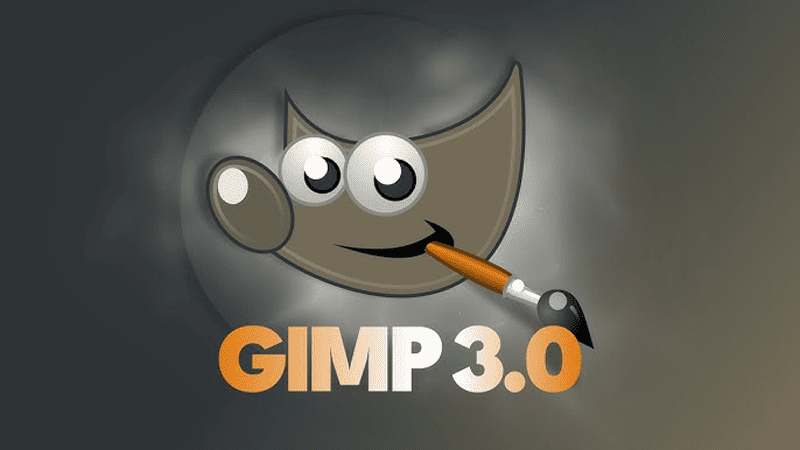
The New Logo: A Modern Take on a Classic Identity
![]()
The new GIMP logo, launched in 2025, retains the spirit of its predecessor while embracing a sleeker, more contemporary aesthetic. At its core remains Wilber, the iconic mascot—a playful, brown dog clutching a paintbrush in its mouth. Introduced in 1996, Wilber has long been a symbol of GIMP’s approachable yet powerful personality. However, the 2025 redesign refines this familiar figure, aligning it with current design trends while preserving its charm.
The updated logo features a flattened, minimalist version of Wilber, moving away from the gradients and three-dimensional effects of earlier iterations. This shift reflects a broader trend in branding toward simplicity and versatility, ensuring the logo looks sharp across various platforms – from software interfaces to merchandise. Notably, the design adapts to operating system guidelines: on macOS, Wilber appears on an easel, adhering to Apple’s icon standards, while other systems showcase a standalone Wilber. This thoughtful variation demonstrates GIMP’s commitment to accessibility and user experience across diverse environments.
How the New Logo Differs from the Old
To appreciate the significance of the 2025 logo, it’s worth comparing it to the previous design, last updated in 2007. The older logo, while endearing, carried a more detailed and textured appearance. Wilber’s fur was rendered with subtle gradients, and his ears—once elongated and slightly cow-like – added a quirky touch. The 2007 version used a warm brown palette with black and white accents, evoking a sense of professionalism and reliability. The paintbrush in Wilber’s mouth, a nod to GIMP’s creative purpose, was a constant, but the overall look felt rooted in an earlier era of digital design.
![]()
In contrast, the 2025 logo streamlines these elements. The gradients are gone, replaced by flat colors that enhance clarity at smaller sizes—a crucial consideration in today’s mobile-first world. Wilber’s ears have been subtly reshaped, shedding their bovine resemblance for a more canine silhouette, refining the mascot’s identity. The brown tones remain but are bolder and more uniform, paired with a simplified brush that emphasizes function over ornamentation. This evolution mirrors GIMP’s own journey: shedding unnecessary complexity while sharpening its focus on usability and modernity.
One striking difference is the logo’s adaptability. The old design, while iconic, wasn’t optimized for the diverse contexts GIMP now inhabits—think high-resolution displays, dark-mode interfaces, or tiny app icons. The 2025 version addresses these needs with a scalable, clean aesthetic that retains its personality without sacrificing practicality. It’s a logo built for the future, reflecting GIMP’s role as a tool that bridges past achievements with new possibilities.
The Timing and Context of the Release
The debut of the new logo in 2025 coincides with the stable release of GIMP 3.0 – a major update seven years in the making. This synchronicity is no accident. GIMP 3.0 introduces transformative features like non-destructive filters, improved Photoshop file support, and a revamped user interface, signaling a leap forward for the software. The logo’s refresh complements this milestone, visually signaling that GIMP is not just maintaining its legacy but actively evolving to meet contemporary demands.
The timing also aligns with a broader wave of excitement in the open-source community. After years of anticipation, including release candidates tested throughout late 2024 and early 2025, GIMP 3.0 arrived to widespread acclaim. The logo’s unveiling became a celebratory capstone, reinforcing the project’s momentum and the dedication of its contributors. It’s a moment of renewal, inviting both longtime users and newcomers to rediscover what GIMP has to offer.
Community Reaction and Future Implications
The GIMP community has greeted the new logo with a mix of enthusiasm and curiosity. On platforms like Reddit and X, users have praised its modern flair, with some noting how it aligns with the polished aesthetics of GIMP 3.0’s interface. Others have expressed nostalgia for the old design, though most agree the update feels timely. The logo’s versatility has sparked discussions about potential merchandise—think stickers, t-shirts, or even custom themes—highlighting its role as a unifying symbol for GIMP’s global user base.
Looking ahead, the logo’s release could signal a new chapter for GIMP’s branding and outreach. While marketing has never been the project’s forte—relying instead on word-of-mouth and community support—this fresh identity might inspire greater visibility. As GIMP competes with both free tools like Photopea and premium software like Affinity Photo, a strong, recognizable logo could bolster its appeal, especially among younger creators drawn to open-source solutions.
A Symbol of Continuity and Change
The launch of GIMP’s new logo in 2025 is more than a cosmetic update—it’s a testament to the software’s resilience and adaptability. From its humble beginnings as a student project to its status as a global creative powerhouse, GIMP has consistently defied expectations. The redesigned Wilber encapsulates this duality: a nod to its playful roots and a bold step into the future. As GIMP continues to innovate, this logo will serve as a beacon for its community, blending tradition with transformation in a way that only an open-source icon can.
Whether you’re a seasoned GIMP user or a curious newcomer, the new logo invites you to explore what’s next for this remarkable tool. With GIMP 3.0 in hand and a revitalized identity on display, the possibilities are as boundless as the creativity it inspires.


