 Most people subconsciously associate all shared rides and e-taxi services with Uber. Why? Its unique logo and hard-fought market position complement the brand efforts.
Uber’s logo has changed over the years to reflect changes in the company’s operations. Each transformation brought the firm closer to its market, as evidenced by its logos.
A Short Story
Uber began with an innovation born from frustration, like most great companies. The difficulty in hailing a taxi on a cold, snowy night in Paris led Garrett Camp and Travis Kalanick to think of a solution.
Their answer? An app where passengers could order taxis in good time and get great service. It took nearly two years from the Paris night in 2008 for UberCab (the first company name) to launch and have its first ride in 2010.
UberCab later rebranded as Uber, and the company’s logo was upgraded alongside. Today, it serves dozens of countries and facilitates transportation for millions of travelers. It is now easy for foreigners to travel through Finland, Brazil, and other countries without even speaking a word of a second language. All they have to do is move around with the app and input their destination.
The Early Days
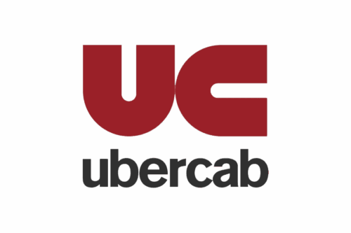
Not many people will recall the first U and C that was the firm’s logo back in 2009. It had a simple but attractive design done in gold, red, and black colors. The text font was Sans-serif, and it had the look of greatness in the early stages. What stood out particularly was how the two letters were exactly the same shape. If we turn C 90 degrees to the left, then it becomes a U, and vice versa. This early days’ logo was created to convey trustworthiness.
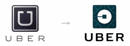
Progress comes with changes, and so their logo redesign in 2012 wasn’t a surprise. The creators went for a stylized U written in clean, modern font this time. This new deep black and bright orange color scheme reflected the company’s renewed energy and commitment.
This period also saw it break new ground in the transportation sector, even though there were some challenges along the way.
Bold Steps (2016)
Uber rebuilt its mobile app from scratch in 2016 as it wanted to redesign the product. The new design came with a new logo and a fresh face.
The business trashed the iconic U and replaced it with a futuristic concept design. The new logo had a light blue abstract pattern, with a white circle inside a light blue square with rounded corners. The CEO at the time said, “The new logo celebrates technology as well as the cities we serve.”
But it received criticism from designers and social media users. Customers who felt there was no need for a new logo voiced their concerns as they were already used to the old one. Despite criticisms, Uber kept the logo for some time before a new design in 2018.
2016 was eventful for Uber. The company merged its China operations with Didi Chuxing and expanded Uber Eats. They reached over 65 countries by December 2016.
The Uber Text Logo (2018–Present)
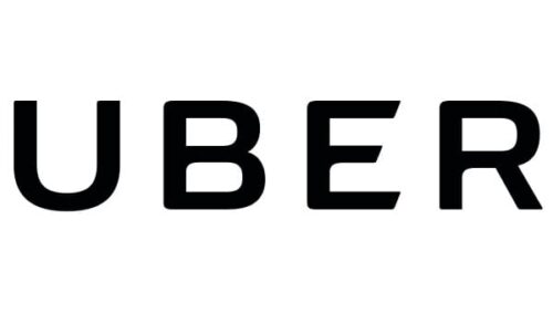
Uber finally changed the logo in 2018 and switched to the animated text that it still uses today. The decision was made, after 1000 hours of consultations, to reflect its journey through the years.
The logo shows an animated Uber text with a black background and two road lanes at the opening and closing. The text font used is the Uber Move (a Sans-serif-inspired font).
The logo redesign became a success as Uber now has a 92% brand awareness rate in the United States and a huge market share in the mobility service.
So, who are the brains behind the logo? Uber consulted Wolff Olins for the logo. The firm also worked with in-house designers and Jeremy Mickel (the person behind Uber Move typeface) to work on the logo.
Growth and Simplicity Can Merge
The company’s journey through the years to become one of the biggest mobility firms globally is exemplary. This model shows what’s possible when simplicity meets digital transformation. Today, Uber is profitable and easily recognized by its logo.
Yet, the company retains the trust of millions of customers and keeps its simple logo that connects them with their customers.
The lesson for other brands and designers is to keep things simple but efficient. After all, as Dieter Rams said, “Good design is as little design as possible.”


