Swisscom entered the Swiss telecommunications market in 1988 after the privatization of the state-owned PTT, which was a monopoly at the time. Today, Swisscom is one of the leading providers not only in Switzerland but also in Italy. The company provides communication, hosting, IT, and entertainment services. Swisscom is also among the most influential telecommunications companies in the world. That is why any even minor changes in everything related to the company, including its visual identity, are closely monitored.
So, in 2025, Swisscom unveiled its updated logo for the first time since 2007. At that time, the prototype of the current logo made a lot of noise: it was the first logo in Switzerland to use an animated element. At the time, Swisscom’s visual identity was developed by London-based firm Moving Brands together with Swiss designer Bruno Maag.
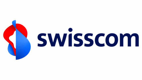
As for the updated logo of the Swiss telecommunications company, it, in principle, fully repeats the idea and style of its predecessor: a dynamic emblem in blue, red and white colors, and dark blue lowercase lettering in a modern sans serif font with some angles of the letters’ bars softened. The main difference between the two emblems is in the color palette: the refined logo uses brighter and lighter shades of blue and red, but only for the graphical element, not the wordmark.
Also, the primary version of the Swisscom visual identity now has a different geometry: if before the emblem was mainly placed above the lettering part, now both elements are set in one horizontal line, with the graphical part on the left of the composition.
