Colgate Raiders is the name of an athletic program from Colgate University, which was established in 1819 and is based in New York State. The sports program of the liberal arts college is composed of 23 men’s and women’s teams, which are all part of the first division of the National Collegiate Athletic Association.
Meaning and history
Apart from playing in Division I of the NCAA, Colgate Raiders athletic program is a member of the Patriot League, an association founded in 1986, and the Colgate Raiders hockey team plays in the ECAC Hockey, established at the beginning of the 1960s, and being one of the six NCAA ice hockey leagues of the first division.
What is Colgate Raiders?
Colgate Raiders is a collegiate athletic program of Colgate University, which consists of 11 men’s and 12 women’s teams, which compete in various sports disciplines, including indoor and outdoor Track & Field, Swimming & Diving, Cross Country, Basketball, and many others.
As for the visual identity, the logo of the athletic program from Colgate University has always been executed in a dark red color palette, which is a representation of passion and power, confidence, and excellence. The badge of the Colgate Raiders has undergone several redesigns throughout the years, but all of its versions are based on the capital letter “C” as the central element, and all of them boast a pretty simple idea.
1950 – 1961
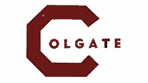
The Colgate Raiders logo, introduced in 1950, stayed with the athletic program for almost 17 years. It was a dark red, almost burgundy-brown badge, composed of an enlarged angular capital “C”, followed by an “Olgate” lettering in smaller capitals of a bold sans-serif typeface with the letters featuring rounded shapes. The whole badge was set in one shade of red, and each of the elements had a thin black outline.
1961 – 1977
The redesign of 1961 has refined and simplified the original Colgate Raiders logo concept, keeping the burgundy color palette untouched. The geometrical “C” grew taller and became a bit narrower than the previous one, and the additional lettering was completely removed from its negative space. In this execution, the logo stayed active for more than fifteen years.
1977 – 1991
Another version of the Colgate Raiders’ visual identity was introduced in 1977, following the same idea and concept as the two previous ones. The line of the geometric “C” became thinner and the contour of the capital character became larger and wider, making up a more stable figure, which represents strength and confidence.
1991 – 2001
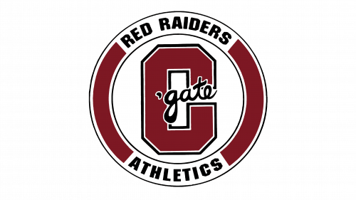
In 1991 the Colgate Raiders logo gets a more modern and confident look, with the letter “C” redrawn, becoming much bolder and slightly narrower, and placed on a white background inside a badge with a circular frame. The letter now featured a double white and black outline and a black cursive “‘gate” in the lowercase, overlapping it diagonally. As for the framing, it was set in the same burgundy shade, as the body of the letter, and had two white inserts on top and at the bottom, with two black wordmarks in all capitals set on them: “Red Raiders” and Athletics, on top and at the bottom respectively.
2006 – 2020
The redesign of 2006 has created a completely different Colgate Raiders logo, with the burgundy, white, and black color palette remaining untouched. The composition features two arched lines of lettering: the enlarged geometric “Colgate” in a strong serif, with burgundy characters outlined in white, and an extended white “Raiders” written across a narrow burgundy ribbon at the bottom.
2020 – Today
In 2020 Colgate Raiders decided to come back to its original minimalistic idea, where there was just the capital “C” in burgundy, drawn against a plain white background. But this time the letter is written in a classy rounded shape, with the straight cuts of the ends, and a thin double outline in white and burgundy.


