

![]() Dreamcast Logo PNG
Dreamcast Logo PNG
Dreamcast is a home video game console by Sega, with one of the most impressive gaming libraries in history. The console was released in 1998 but its production was discontinued after two years.
Meaning and history
![]()
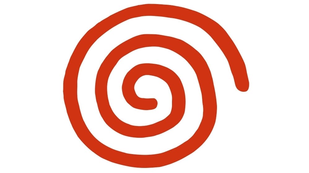
The Dreamcast logo became iconic in its industry. A light typeface of the wordmark in black is complimented with an orange bold spiral on the top.
But the Europeans do not know the Dreamcast logo in orange. The brand had to change its logo color to blue for European version, as there was an issue with Tivola, a German company, which was using a similar orange swirl logo at that time.
Both blue and orange Dreamcast colors symbolize vitality, fun and joy, the main aim of any Game-industry product. Even today The Dreamcast Spiral is considered to be one of the most recognizable logos in the industry, despite the fact, that the brand was on the market for just two years.
1997 – 1998 (pre-launch)
![]()
For various reasons, the project changed a couple of brand names before it adopted the current one. For instance, Sega chose the name Katana to refer to the Japanese sword of the same name.
The pre-launch logo, technically, was completely different from everything that followed, yet the spirit was already there: playful, laid-back, and careless. At least that’s the mood that the handwritten type conveys. It was also optimistic, due to the upward direction of the wordmark.
1998 – 2007 (Japan), 1999 – 2001 (North America/Brazil)
![]()
The characteristic relaxed style you could already notice in the previous design is now reflected in the uneven outline of the spiral emblem. It looks as if it has been drawn with a thick brush, and the person who drew it didn’t care much about doing everything perfectly.
1999 – 2002 (Europe/Australia)
![]()
The second version of the logo, in blue, was developed for selected locations. Other than the color, it looked pretty much the same. The wordmark was preserved intact, with its light and elegant typeface. The type was very different from the careless spirit of the emblem – the glyphs seem to embody the craftsmanship and precision needed to create a product like Dreamcast.
Font and color
The simple yet very modern and recog
nizable Dreamcast logotype, executed in a title case, is written in a custom typeface, which is pretty close to Alexon RR Light Regular and Arpona Light, with their full-shaped round letters and playfully flared ends of the bars.
The logotype is usually executed in black or dark gray colors, standing for confidence, strength, and competence. While the graphical part of the logo can be seen in two different shades of orange — a classic bright one, evoking a happy and pleasant feeling, and the darker version, closer to red, a symbol of passion and power.


