The history of C.P. Company started in 1971. Today, the Italian apparel brand often conducts research and design into military uniforms and work suits.
Meaning and history
Italian fashion brand CP Company was founded in the early 1970s by graphic designer Massimo Osti. He originally named his brainchild Chester Perry Company. The name was taken from the comic “Bristow” by Frank Dickens. In them, the main character works as a clerk in the Chester Perry building. However, British fashion brands Chester Barry and Fred Perry didn’t like the similarity of the names and filed a class action lawsuit, so the company had to rename itself C. P. Company.
However, the renaming did not affect the philosophy of the brand or the ambitions of the chief designer. Massimo Osti has always been inspired by military and work uniforms, trying to make something completely new out of standard items of clothing. Thus, the designer developed a new technology for dyeing ready-to-wear items, which involves coloring models made of white or untreated undyed fabric only at the last stage of production.
The CP Company brand has become not just an ordinary clothing manufacturer, but a full-fledged laboratory, where new technologies are constantly being developed and experiments with different materials are conducted. During its history, CP Company has produced more than 50 thousand items of clothing, each of which reflects the basic philosophy of the company – functionality and innovation. This Italian clothing brand reinterprets traditional fabrics and develops its own technologies, which makes it so popular and unique.
What is C.P. Company?
C.P. Company is an Italian fashion brand known for its innovative and functional designs. Founded in 1971, the company combines traditional craftsmanship with cutting-edge technology to create unique and stylish clothing, particularly renowned for their iconic goggle jackets.
1971 – 1978
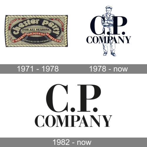
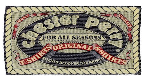
The original logo of the C. P. Company brand, designed in 1971, featured a stylized image of a black life preserver bound in red ribbon with additional writing. The main lettering was set in the top part of the preserver, executed in a bold old-style sans-serif font with voluminous and massive lowercase characters. The whole image looked pretty nice yet a bit overwhelming, and this was probably the reason why this logo only stayed in use for seven years.
1978 – Today
The redesign of 1978 has kept the sailor mood of the badge, yet in a way completely different from the original badge. Now the decorative element of the composition was a figure of a sailor drawn in thin blue contours on the background, overlapped by a classy black uppercase lettering in an elegant font with triangular serifs on the ends of the bars.
1982 – Today
The C.P. Company logo is far from being cluttered or overtly emotional. It is muted, balanced, and moderately elegant. The serif type has classic proportions. If you try to find a similar type in the world of fashion house logos, you may look at the Guess logo as an example of another wordmark based on a similar font.
Of course, the font in the C.P. Company wordmark is not exactly the same – the width of the line forming the glyph varies more here. Also, the way the letters “C.P.” dominate the design make it stand out.


